
Why plainplan Has Nothing Printed on It
No quotes, no photos, no habit trackers, no moon phases. A wall planner with nothing on it is not an unfinished product. It is the product. Here is the thinking behind the emptiest calendar you can buy.
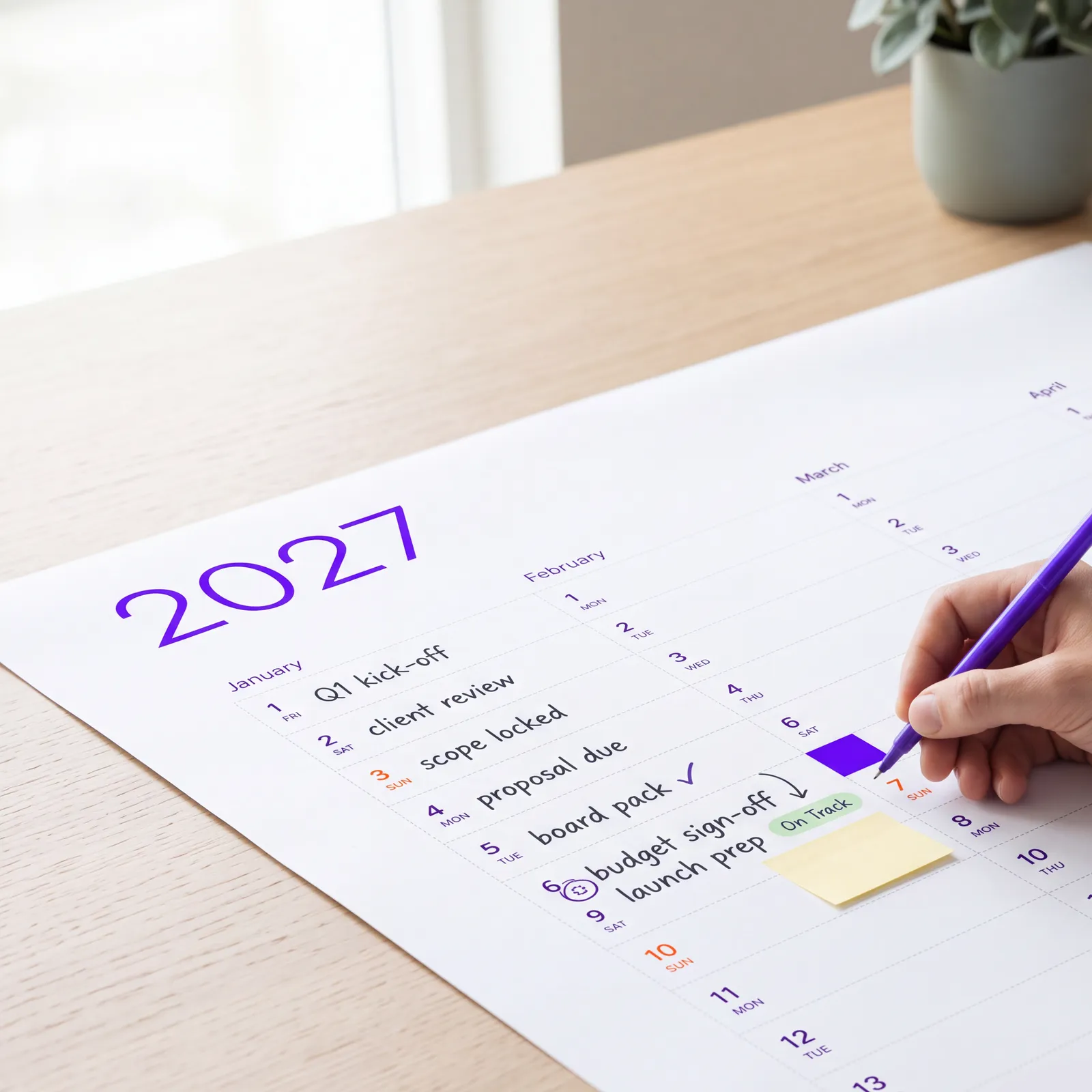
The calendar aisle
Walk down a calendar aisle in December and count what is printed on the products. Landscapes. Puppies. Inspirational quotes. Tiny day cells under a large photograph, because the photograph is what sells the calendar in the shop. Then count how many of those calendars are still being written on in April.
The calendar industry designs for the moment of purchase. plainplan is designed for the eleven months after it.
A grid is a decision not to decide for you
Every printed element on a calendar is a decision the designer made about your year. A habit tracker assumes you track habits. A school-term band assumes your country's terms. A photo of the sea assumes you want the sea on your wall in a meeting room. A blank grid assumes only that you have a year and a pen.
That is why one plainplan file works as a family command centre, an office deadline board, a teacher's term plan, a marathon block or a garden's sowing calendar. It is not a product for each of those people. It is the same empty sheet, and each of them fills it with something different. The audiences on the homepage are not variants; they are demonstrations of range.
What empty makes possible
Large day cells, first of all. Remove the imagery and the whole sheet becomes writing space - which is the one feature every calendar buyer says they want and almost no calendar provides. Then colour: on a white grid, four highlighters become a system that is readable from across a room. On a printed photograph, the same highlighters disappear.
And size. A blank vector grid prints at A3 for a kitchen or A0 for a reception with the same file, because there is no photograph to pixelate and no layout that only works at one size. The vector format is only possible because the sheet is empty.
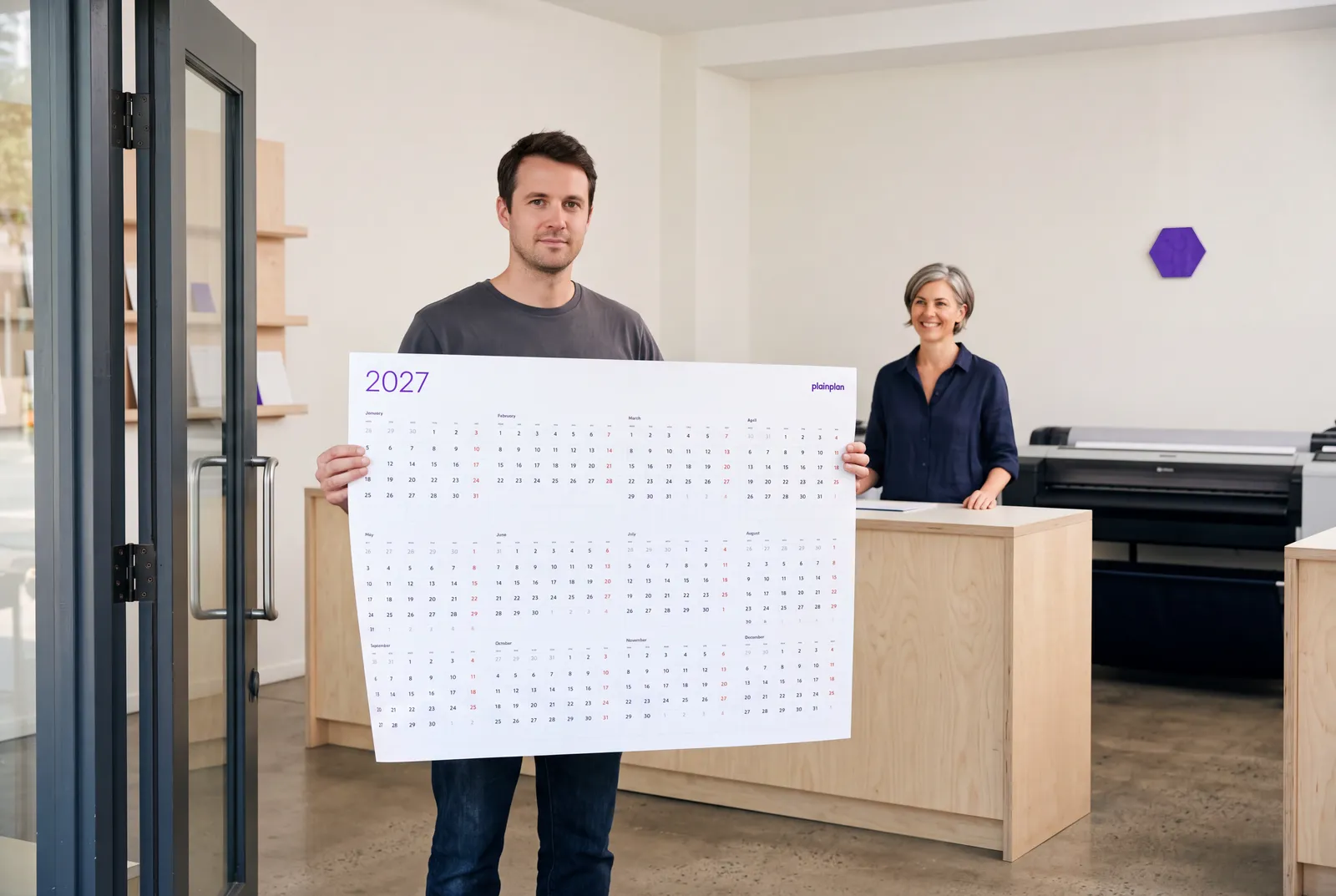
Try 2026 for free
before you buy 2027
The emptiest calendar you can buy. 2026 is free, 2027 costs less than the coffee you will drink while filling it in.
Where the design actually went
Nothing printed does not mean nothing designed. Fifteen years of UX work went into what remains: the proportion of a day cell to a handwritten word, the weight of the grid lines so they guide the pen without competing with it, the two layouts - Vertical for a year at a glance, Square for people who think in months - and the week start fixed by language so a Sunday-start sheet never reaches a Monday-start country.
The two-grid decision and the A4 decision are written up separately. Both came from the same rule: remove until the calendar only does its job, then stop.
The same file, every year
A calendar with nothing on it does not go out of fashion, because there is nothing on it to date it. Next year's plainplan is this year's grid with the numbers moved. The colours you chose, the size you print, the place on the wall - all of it carries over, and the only thing that changes is the year in the corner.
That is the whole product. A blank year, made carefully, printed once, filled in by you. If that sounds like too little, the calendar aisle is still there in December.
