
Why plainplan Ships Two Grids Instead of One
I wanted one perfect layout. Testing kept telling me there isn’t one. Here is why the Vertical grid and the Square grid both exist, and why they come in the same purchase.
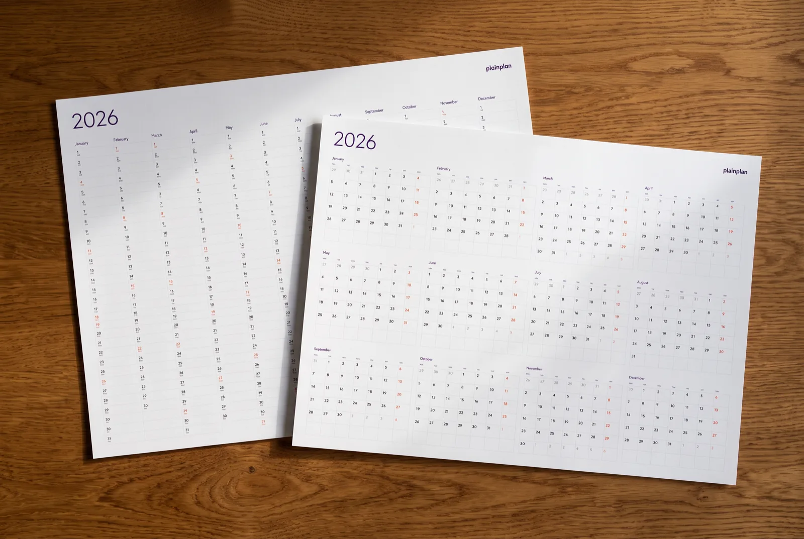
I Wanted to Ship One Layout
I have been designing interfaces for fifteen years, and the instinct that survived all of it is this one: pick the better option and remove the other. Choice is a cost you push onto the person using the thing. Two layouts means a comparison page, twice the files, twice the print testing, and a decision the buyer has to make before they know what they are deciding about. Everything about shipping one grid was easier, and I fully intended to do it.
So I built both, expecting one of them to lose. That is the normal outcome. You put two candidates in front of people, one reads better, you delete the other and write a confident sentence about why.
Neither one lost. That is the whole story of this post, and I have made peace with it, but it took a while.
The Vertical Grid: the Year as One Sweep
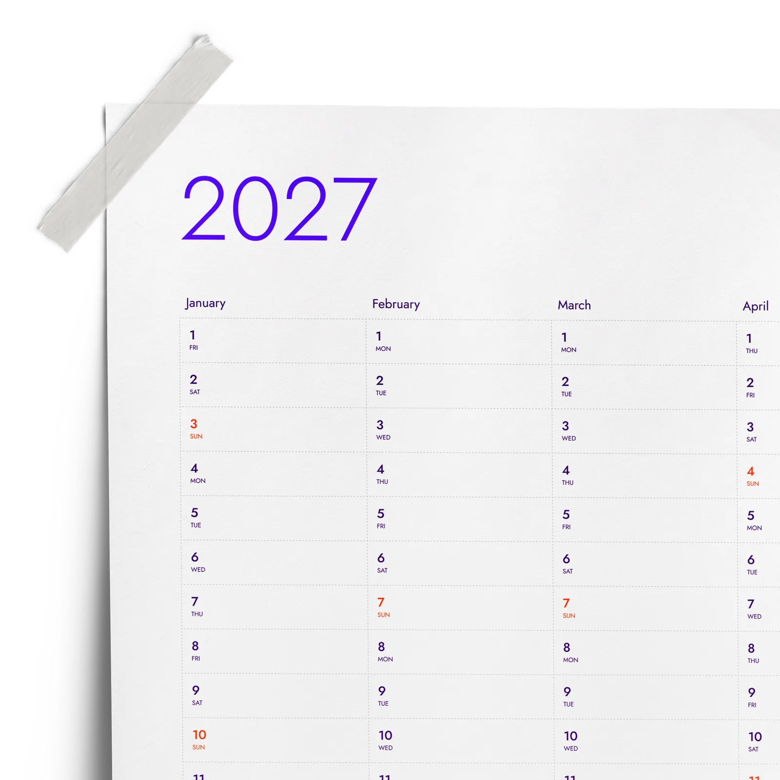
In the Vertical grid, each month is a vertical column and the days run down it. Twelve columns, side by side, the whole year on one surface. You do not scan it month by month. You read across it, the way you read a chart.
That is what it is good at: patterns. When you look at a year built this way, you see the shape of it. Three columns in a row with nothing in them and then one that is packed solid. A deadline in April sitting directly next to the holiday in April that you had forgotten about. Two projects you thought were sequential turning out to overlap by three weeks. None of that is information you go looking for. It is information that arrives because the layout put it next to itself.
For anyone planning at the scale of a year rather than a week, this is the layout I would push. It answers the question “how is this year actually shaped” better than anything else I have drawn. It is also the layout that people either love on sight or find slightly alien, and the split is not subtle.
The Square Grid: the Month You Already Know
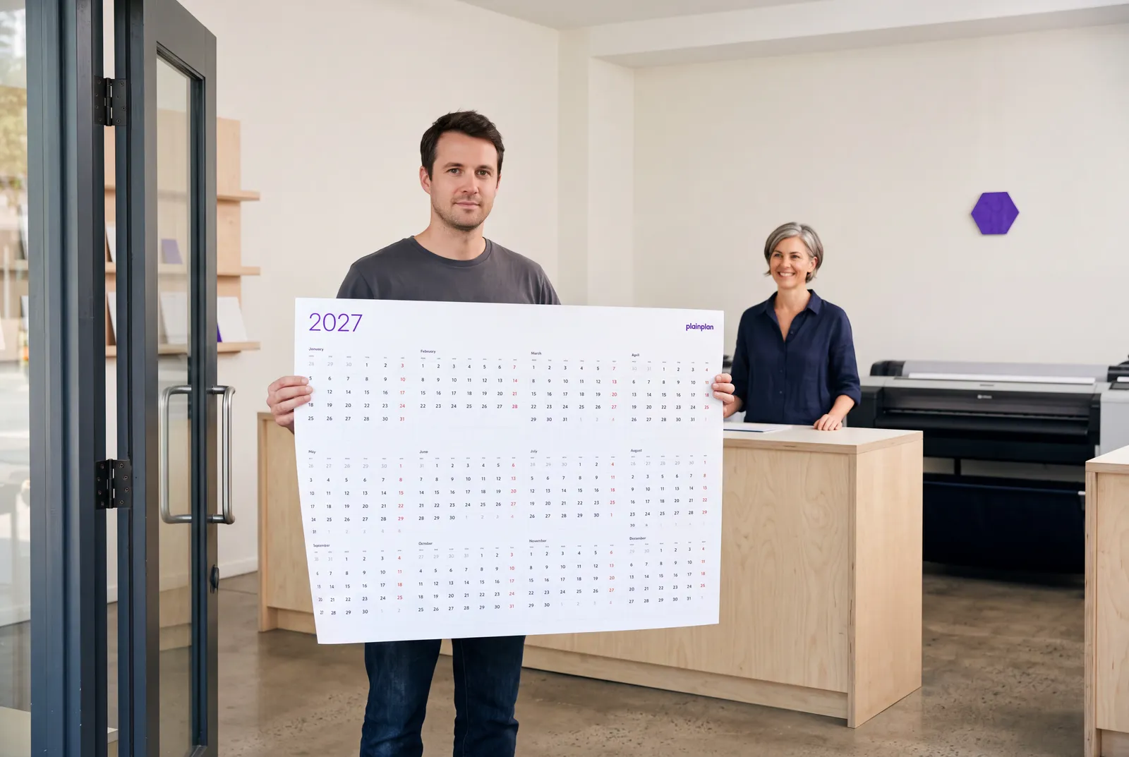
The Square grid is the classic monthly block. Weeks as rows, days as squares, the arrangement on every kitchen calendar and every phone screen you have ever used. On the plainplan poster you get all twelve of those blocks on one sheet.
There is a temptation, when you have made something new, to treat the familiar option as the concession. I do not think that is right here. The monthly square is better at a real job: coordinating things inside a month. When the question is which weekend, or where a week falls, or how many working days sit between two dates, the square block answers it immediately because the week structure is drawn into the shape. In the Vertical grid you can find the same answer, but you count for a moment first.
There is also the plain fact that people can already read it. Nobody needs an explanation. A planner that has to be explained to the family before it works on the kitchen wall has a problem the designer created.
Try 2026 for free
before you buy 2027
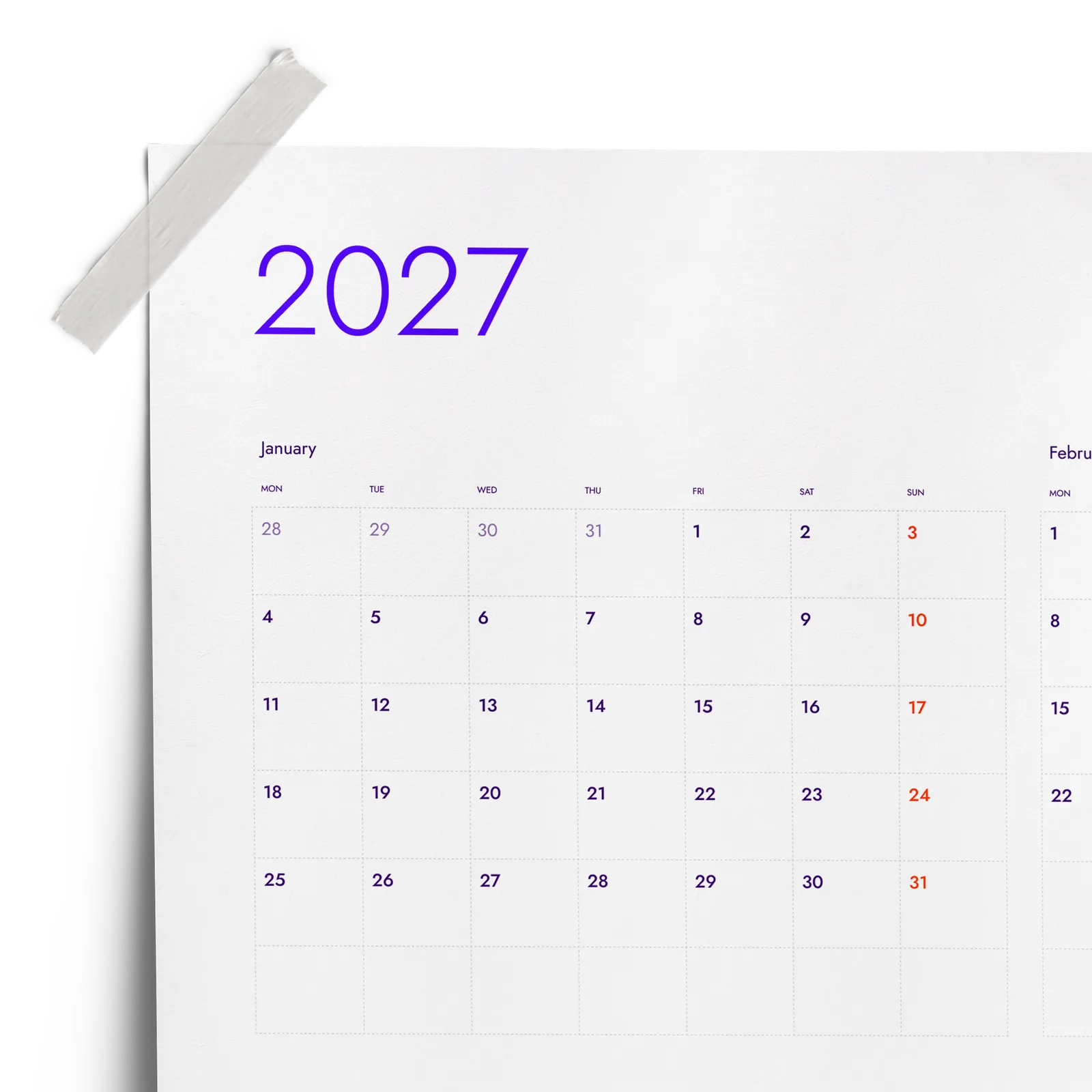
One file. Any wall. Always sharp.
The Part That Was Harder Than Expected
The honest reason there are two grids is that heads work differently. Some people hold a year as a timeline, one continuous run from January to December. Some people hold it as a set of twelve boxes. Show a timeline reader the square grid and they lose the through-line. Show a box reader the vertical grid and they get a wall of columns.
I could not find a way to be right for both in one layout. I tried. Every compromise I drew was worse than either of the originals, which is the usual fate of compromises in layout work. So I stopped trying to average two mental models and shipped both.
What was harder than I expected was not the drawing. It was everything after: two layouts across two print formats and six languages, and the rule that when one source file changes, every pack gets regenerated so nothing drifts. Shipping one grid would have halved that permanently. It also would have made about half the buyers quietly wrong, and told them it was their fault for not getting on with the layout.
One clarification worth putting in writing, because it is the single thing people ask about most: both posters are landscape. “Vertical” describes the direction the grid runs, not the orientation of the paper. Nobody is getting a portrait poster.
Why You Don’t Have to Choose Before Buying
If two layouts is the right answer, making people pick between them at checkout is the wrong way to deliver it. At that point they have seen two thumbnails. They have not lived with either one on a wall for a month, which is the only test that actually decides it.
So both grids are in the same purchase. One price, both layouts, in every print format and language in the pack. Print the one you think you want, and if it turns out you were wrong about your own head, print the other. The file is already yours, and because it is a vector PDF, printing it again at any size costs nothing but the paper.
I would rather absorb the extra production work than sell someone a decision they were not equipped to make yet. That is the trade, and I still think it was the right one.
Frequently asked questions
No. Both grids print as landscape posters. The name describes the direction the grid runs - months as vertical columns - not the orientation of the paper.
If you mainly want to see the shape of the whole year and spot patterns across months, start with the Vertical grid. If you mainly coordinate events inside a month, start with the Square grid. Both are in the pack, so starting with the wrong one costs you a sheet of paper.
No. One purchase includes both grids, in every print format and language in the pack. You are not choosing at checkout.
Yes, and some people do - the Vertical grid for the year overview and the Square grid for the month in front of them. They answer different questions, so they sit next to each other without competing.
I tried. Every version that tried to serve both readings was worse than either original. Averaging two mental models produces a layout that fits neither, so I stopped and shipped both.
