
Why Productivity Apps Fail (And Why a Wall Planner Doesn’t)
Apps are optimized for engagement, not completion. Here’s why a wall planner succeeds where productivity apps fail - and where apps still win.
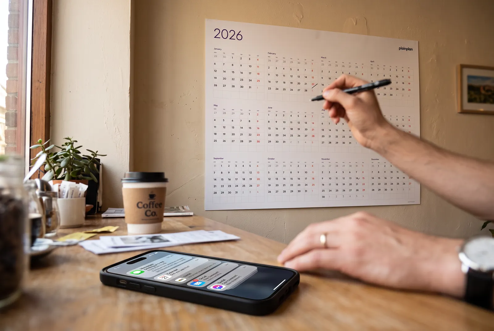
The App Needs You to Come Back. The Planner Doesn’t.
Productivity apps are not neutral tools. They are products built by companies that benefit from you using them more often, not less. That structural fact shapes everything about how they’re designed - the notifications, the streaks, the inbox counts, the daily reminders. All of it is optimized for engagement, not completion.
Consider the incentive structure of a task management app. The company grows when users are active, when they recommend the app to others, and when they upgrade to paid plans. So the app is designed to pull you back in: notifications that your task is overdue, weekly summaries of your productivity score, friction when you try to cancel.
None of that is inherently malicious. It’s just how software businesses work. But it creates a misalignment: the app benefits from you checking it often, while long-term planning benefits from you checking it rarely. A good annual plan shouldn’t require daily interaction. The quarterly review is the interaction. The rest is just execution.
Reorganizing Your System Feels Like Work
There’s a failure mode common to people who use multiple productivity tools: they spend time reorganizing instead of executing. New folder structure in Notion. Different tag system in Things. A new template for weekly reviews. The activity feels productive because it’s deliberate and takes effort, but it produces no output.
This isn’t a character flaw - it’s partly a design consequence. Apps make reorganization easy and satisfying. Dragging tasks between projects, renaming categories, setting up new views - these are low-friction actions that release a small sense of accomplishment. They’re also a way of not doing the harder thing.
A wall planner makes reorganization genuinely difficult. You can write over something, use correction fluid, or attach a sticky note. You cannot drag and drop. That friction is a feature. It raises the threshold for unnecessary reorganization and keeps the focus on the actual plan. Cal Newport makes a related argument in Digital Minimalism (2019): fewer, more intentional tools reduce the cognitive overhead of managing the tools themselves.
The Cost of Constant Interruption
Every notification from a productivity app is an interruption. Gloria Mark at the University of California, Irvine has studied workplace interruptions for over two decades. Her 2008 paper “The Cost of Interrupted Work: More Speed and Stress” found that people who are interrupted complete tasks faster to compensate - but at a measurable cost in stress and frustration.
The American Psychological Association notes that task-switching carries a real cognitive cost: the brain must disengage from one task and re-engage with another, and this switch takes time and mental effort even when the switch itself feels instant. The research term is “switch cost” - and it compounds when you’re switching between several apps throughout the day.
A wall planner generates zero notifications. It doesn’t interrupt you. You consult it when you choose to, and then you leave it. That passive relationship is the point.
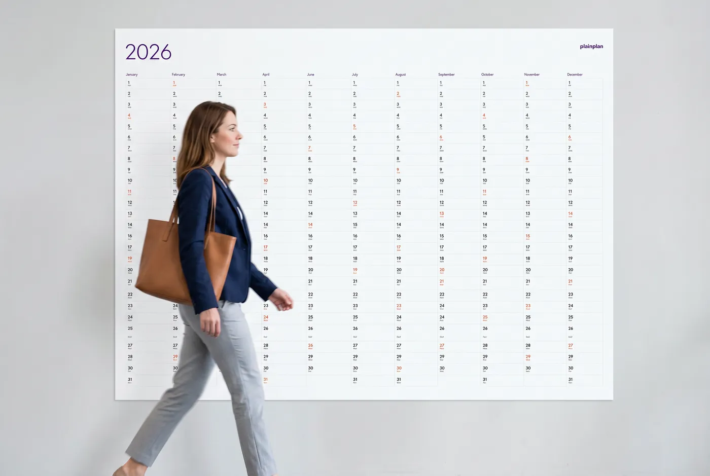
You Have to Open an App. You Walk Past a Planner.
The practical difference between an app and a wall planner comes down to one thing: an app requires you to initiate. You have to pick up your phone, navigate to the app, and open it. If you’re in a different mental mode - making coffee, leaving for a meeting - the app doesn’t register at all.
A wall planner is ambient. It exists in your physical space and enters your field of view without any action on your part. You walk past it fifteen times a day. You look at it while you’re on a phone call. You notice, without deciding to notice, that the deadline you set is closer than you thought.
Researchers studying ambient information displays have found that peripheral visibility of information - data present in the environment without requiring active attention - supports awareness and decision-making in ways that active consultation does not. The planner functions as an ambient display: always present, requiring no interaction to deliver its basic message. This is also why color coding on a wall planner pays off: the pattern is readable at a glance, without effort.
Try 2026 for free
before you buy 2027
One file. Any wall. Always sharp.
Writing Is Harder to Undo Than Typing
When you type a goal into a task management app, deleting it requires exactly one action: select and delete. There is no friction. The goal disappears cleanly and the record of it disappears with it.
When you write a milestone on a wall planner and it doesn’t happen, it stays there. You look at it. You notice it was supposed to happen and didn’t. That visibility is uncomfortable in a way that has practical value - it creates a mild accountability that doesn’t depend on anyone else knowing your goals.
This isn’t about self-punishment. It’s about signal fidelity. A system where targets are easy to erase gives you a blurry picture of how the year is going. A system where erasure requires actual physical effort gives you a clearer picture. You see the gap between what you planned and what happened, and that information is useful. For a practical setup, see how to use a wall planner effectively.
Apps Are Still Better at Several Things
Productivity apps are genuinely better at collaboration. If multiple people need to see and update the same task list, an app is the right tool. A wall planner is one physical object in one physical location - it doesn’t sync.
Apps are better at reminders. A wall planner doesn’t ping you an hour before a meeting. If you need recurring task prompts, date-based alerts, or automated workflows, apps handle that and a wall planner doesn’t.
Apps are better at search. “What did I decide in March?” is answerable in seconds in Notion and requires squinting at a grid on a wall planner. For knowledge management and retrieval, apps win. For year-at-a-glance orientation, the wall planner wins. These aren’t competing categories - they’re complementary ones. If you want to understand what to put on the planner vs. what stays in an app, the case for a vector PDF explains why print quality matters for the physical side of this equation.
Frequently asked questions
Not inherently - they’re bad for a specific type of productivity. For daily task management, collaboration, and search, apps are excellent. For long-horizon annual planning that benefits from ambient visibility and low maintenance, their engagement-optimized design works against the goal. The problem is using them for something they weren’t designed to do.
Yes, and that’s the recommended approach. Use apps for daily tasks, meeting notes, and collaboration. Use the planner for the shape of the year - quarterly milestones, major deadlines, and blocks of time when projects need to be in motion. They answer different questions and don’t compete.
Long-term planning requires a different mode of thinking than daily task execution. Frequent interruptions - notifications, badge counts, weekly summaries - keep you in reactive mode, focused on what’s immediately due. Annual planning requires a more reflective mode where you can assess where you are in the year and whether you’re on track for goals that resolve months from now.
No. The argument is that tools should be chosen for what they’re good at. Productivity apps are good at task management, collaboration, and retrieval. Wall planners are good at ambient orientation and annual structure. The failure pattern isn’t using apps - it’s expecting apps to replace the function of a physical, always-visible year overview.

Sources
- Mark, G., Gudith, D., & Klocke, U. - “The Cost of Interrupted Work: More Speed and Stress” - CHI 2008 (UC Irvine)
- Multitasking: Switching Costs - American Psychological Association
- Cal Newport - Digital Minimalism: Choosing a Focused Life in a Noisy World (2019)
- Ambient Information Design for a Work Environment - Springer (2023)