
Color Coding Your Wall Planner: 5 Systems That Actually Work
Most color coding systems collapse by February because there was no clear rule for what each color means before the year began. These five systems are specific enough to apply immediately.
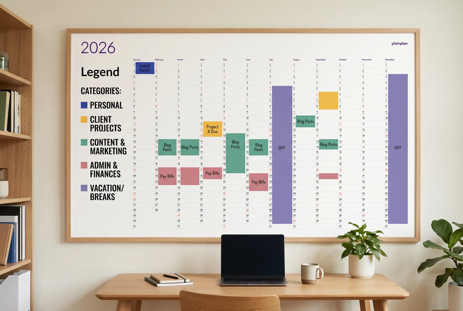
System 1: Life Area - Work, Family, Personal, Health
This is the most universal system and the right starting point for most people. Assign blue to work, green to family, orange to personal time, and red to health. Those four areas cover the vast majority of what ends up on a wall planner.
The logic is intuitive: cool colors for obligations, warm colors for personal investment. When you look at the planner from across the room, a run of blue weeks tells you something. So does a month with no green.
Four colors is the sweet spot here - resist the urge to add a fifth for “travel” or “finance.” Those belong under one of the four existing areas. If a color shows up fewer than three times in a month, it probably doesn’t need to exist. Before committing to any system, read the full wall planner setup guide to understand what belongs on the planner in the first place.
System 2: Energy Level - Focus Days, Admin Days, Recovery Days
This system is built for freelancers, remote workers, and anyone who controls their own schedule. Instead of marking what you’re doing, you mark what kind of cognitive state you’re planning for. Dark green for deep-focus days, yellow for meetings and admin, grey for recovery and flex days.
The value becomes visible over time. If you look back at a month and see yellow everywhere, you know why nothing got built that month. If you see a stretch of grey after a conference week, that was a deliberate recovery plan - not wasted time.
Three colors is all this system needs. Some people add a fourth for travel days, but grey handles that fine. The goal is to see your energy allocation at a glance, not to categorize every appointment.
System 3: Project Phase - Planning, Execution, Review
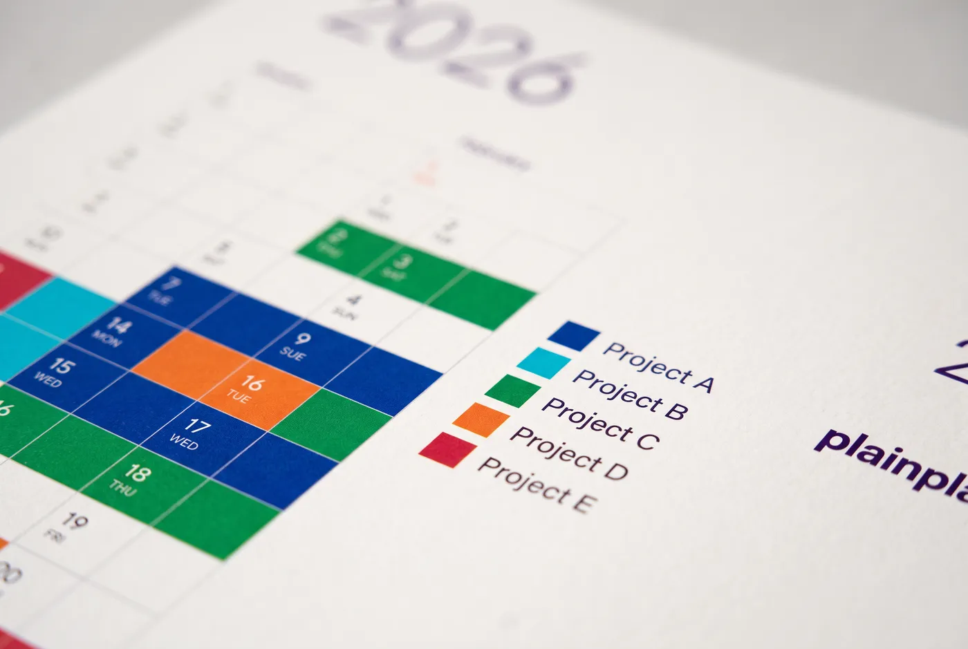
Project managers and product teams often need a system that tracks where projects are, not who owns what. Light blue marks planning phases: scoping, design, stakeholder alignment. Dark blue marks active execution. Purple marks review, wrap-up, and handover.
The three-phase model maps onto most professional projects cleanly. When a project has more phases, they still compress into these three for the wall planner view - you’re not managing the project on the planner, you’re seeing its rhythm against everything else.
This system works poorly if you have more than two active projects running simultaneously. At that point, you’d need a color per project plus a phase indicator, which breaks the five-color limit fast. For multi-project environments, the Life Area system above is a better fit. The year-at-a-glance setup guide covers how to structure project timelines visually on a single sheet.
System 4: GTD Context - @Work, @Home, @Errands, @Waiting
David Allen’s Getting Things Done methodology uses physical location as the organizing principle for what he calls “contexts.” Applied to a wall planner: blue for @work tasks and events, green for @home, orange for @errands that require leaving the house, and yellow for @waiting items where the next action belongs to someone else.
On a wall planner, this is most useful for people who split their time between multiple locations - a few days in the office, a few at home, occasional travel. The color pattern shows which location is dominating which weeks.
The @waiting color is underused but powerful. A streak of yellow on the planner means you’re consistently in a dependent position - waiting on approvals, waiting on other people’s output. That’s useful information to see in aggregate across a month.
Try 2026 for free
before you buy 2027
One file. Any wall. Always sharp.
System 5: Family Roles - One Color Per Person
This is the kitchen wall planner system. Each family member gets their own color: one for each adult, one for each child, plus a shared color for household events like holidays, home maintenance, or family trips. Five members is the practical maximum. Beyond that, the planner becomes unreadable.
The shared color does important work. Without it, family events get duplicated across everyone’s color, which makes the planner noisy. One shared color - a neutral like black or grey - keeps those events clean and immediately distinguishable.
This system requires physical consistency: the same marker or pencil always in the same place, so anyone in the family can mark things without asking which color is theirs. A small labeled key taped next to the planner solves this for the first few months until it becomes habit. See the family command center guide for a full setup of this approach.
Tools, Limits, and One Rule Worth Keeping
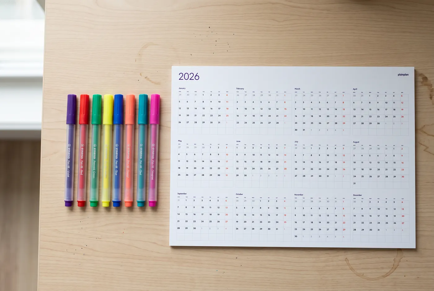
Fine-tip markers give the cleanest results on a printed planner - the 0.4-0.5mm range. They produce a precise line without bleeding through most paper weights. Colored pencils work well for light marking and don’t obscure text. Highlighters are best for backgrounds rather than borders, and they smear easily on laser-printed paper, so test before committing.
The five-color limit is not aesthetic preference - it’s cognitive. Research on visual information processing shows the brain can reliably process and distinguish around four to five distinct color categories without conscious effort. Beyond five colors, you start spending mental energy on the legend instead of the information. Goals and Progress summarizes the principle well: when you see a colored entry, your brain should recognize the category before reading the words.
The single most important rule: decide the system before the year starts. Once you’ve written in the first two months with no system, you’re retrofitting - and you’ll find reasons to keep adding exceptions. Hang a blank planner, choose your system, write the key on a sticky note in the corner, and start from day one.
Frequently asked questions
Four to five is the practical maximum. Research on visual cognition consistently finds that people can reliably track around four to five distinct categories without conscious effort. Beyond five, you start spending mental energy on decoding the legend rather than reading the planner. Start with three or four, and only add a fifth if a clear gap exists in your system.
One color per person is the most effective system for households with multiple people using the same planner. Each adult and child gets their own color, and a shared neutral color - black or grey - handles family-wide events like holidays and trips. A small legend taped beside the planner keeps the system consistent until it becomes habit.
Fine-tip markers in the 0.4-0.5mm range produce the cleanest result - precise lines that don’t bleed through most paper weights. Colored pencils work well for lighter marks that don’t obscure printed text. Avoid highlighters on laser-printed paper as they smear; test any marker on a spare corner before committing to a full month.
Technically yes, but it defeats most of the value. Color coding works partly because the patterns accumulate over time - a run of yellow weeks or a month without green only means something if the same system was in place throughout. If the current system is clearly not working, switch at a natural boundary: the start of a new quarter or a new month, not mid-week.
Not necessarily. If entries are sparse and you only track a handful of fixed dates per month, plain text with shorthand abbreviations may be all you need. Color coding adds the most value when the planner is moderately full - when there are enough entries that reading each one takes effort, and color lets you interpret the planner in a glance. For a lighter-use setup, the basic setup guide covers the fundamentals without color.

Sources